Entries Tagged 'Superficial Satudays' ↓
August 10th, 2013 — Comics, Superficial Satudays
For the 50th anniversary of [arguably] Marvel Comics’s favorite character the House of Ideas commissioned superduperstar artist Marcos Martin to scribble up a number of variant covers, and man were they gorgeous. Jonathan Becker of “Tomfidence” fame brought these to my attention for Superficial Saturdays. Here is my favorite of the set “the 1970s variant”:
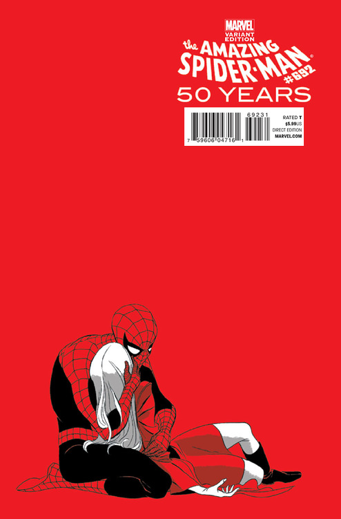
Comic: AMAZING SPIDER-MAN #692
Artist: Marcos Martin
Anyone familiar with Spider-Man’s history knows about the Death of Gwen Stacy; Peter’s true love was murdered by his archenemy the Green Goblin in one of the most famous no-win situations in comics. Martin’s homage is just perfect in my estimation. Despite the dominance of negative space, I think this is a very well-composed image.
The use of color in this image is just… brave. I love flat color but this is just extreme. The red of the background is the same as the red of Spidey’s suit is the same as the red of Gwen’s outfit [and if memory serves she was wearing a green coat in the original]. I love how he uses the limited color palette to imply Gwen’s death. She is all white and gray… Like a ghost.
Goes without saying that the line work on this one is just outstanding. And versatile. You can tell that both images are Marcos Martin but he uses a completely different line than we saw in GREEN ARROW #40. Thanks to Becker; just love this one.
LOVE
MIKE
August 3rd, 2013 — Comics, Superficial Satudays
I was actually clicking around some comics websites looking for news updates on some of my favorite Image books [that haven’t come out in forever], HELL YEAH and DANGER CLUB, and I just saw a banner ad for CATALYST COMIX out of Dark Horse (which was more-or-less a cutaway of the below #1 cover).
I thought it was gorgeous… Kind of like a cross between Geoff Darrow (or maybe P. Craig Russell on SANDMAN) and Popeye cartoons.
So here’s the criteria…
- Banner ad for a [book?] I had never heard of… And who clicks banner ads anyway?
- Not only was it disruptively engaging, eye-catching, and in my opinion gorgeous…
- I even wrote a blog post about it!
Success!
Success?
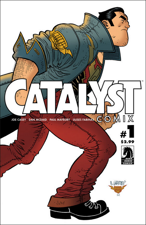
Comic: CATALYST COMIX #1
Artist: Rafael Grampá
Though the Popeye-esque chin on that protagonist (?) is what initially caught my eye, my favorite thing about Rafael Grampá’s cover has to be that right boot. They obviously applied computer coloring to his gorgeous, clean, cartoon-esque line work; but that boot. It’s just a huge chunk of black ink. In fact, it’s almost an eff-you to gradient color. I want to say all the detail is perfectly-applied negative space, but it actually looks like white ink (or at least white Photoshop). Love it regardless. Absolute best thing about a pretty great shot.
So (other than admiring that boot) what do I know about CATALYST COMIX?
Um… Nothing?
I know a mite about writer Joe Casey. He wrote one of my favorite comics, CODEFLESH (link is to a review I wrote on my old blog almost a Deckade ago), was responsible for the ingenious and ultimately unsuccessful WILDCATS 3.0, and is a co-creator of the character Ben 10 as a part of Man of Action; but of CATALYST COMIX, I know nothing.
But I thought the cover was engaging enough to pen these ~200 words.
If you are interested in learning more, Dark Horse has a free CATALYST COMIX preview on their website.
So… What do you think? Good enough cover for a Superficial Saturdays with no other knowledge?
LOVE
MIKE
July 27th, 2013 — Comics, Superficial Satudays
I have always had a short list of artists whose work I just go and buy almost unconditionally. My floppies collections past are littered with old issues of CLAN DESTINE, RUNE, and random Euro comix as testaments to an auto-buy devotion to Travis Charest, Alan Davis, Carlos Pacheco, or Barry Windsor-Smith from back in the 1990s. Today no artist rates higher on my personal scale than Marcos Martin.
You can probably see why:
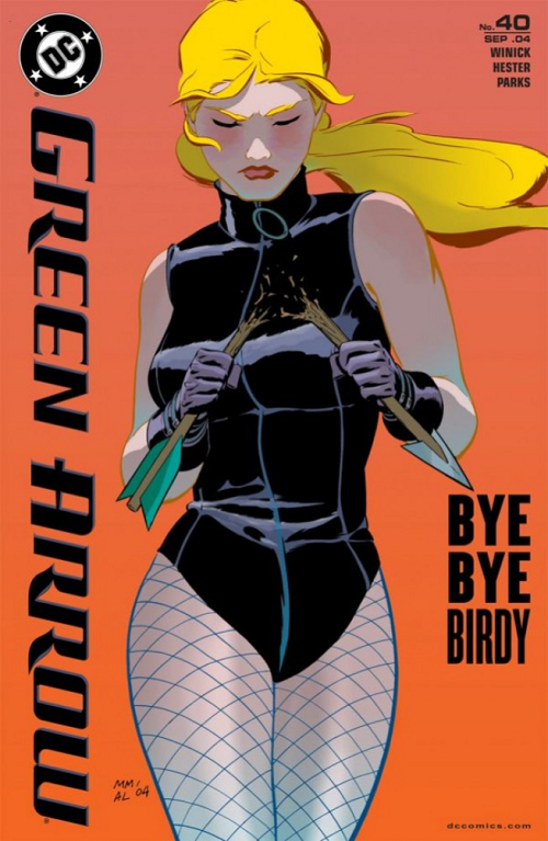
Comic: GREEN ARROW #40
Artist: Marcos Martin
Martin is an absolute master of sequential storytelling but his covers are pretty striking as well (as I am sure you can see).
In such a simple character image he hits so many notes here. Leather. Light. I feel like I can em effin’ swim in the ink pools of Black Canary’s one piece. And check out the hips on dear Dinah! Hips don’t lie BTW. I am just in love with this cover picture. Probably doesn’t hurt that — thanks to Gail Simone on BIRDS OF PREY — Black Canary is one of my favorite characters.
BDM says that one mark of a good cover is how much story it can imply in that single image. I think — and this is guided a bit by the caption on the right, natch — Martin does a spectacular job. Black Canary has a frowny-face. She is snapping an arrow. Her beau’s name is Green Arrow. Might they be breaking up in this ish?
The cover kind of screams that you should want to find out.
LOVE
MIKE
July 20th, 2013 — Comics, Superficial Satudays
I am scratching my head on this one.
This digital image does nothing to convey the power, energy, excitement, and lighting of Thor’s lightning:
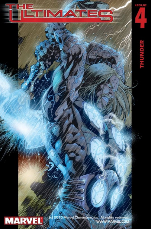
Comic: THE ULTIMATES #4
Artist: Bryan Hitch
You’ll have to accept my apologies, I guess.
But I can dial you back to 2002; it was a wondrous time in comics. BDM was getting THE CRAPTACULAR B-SIDES rolling at Marvel so we talked comics at least as much as we talked about Magic: The Gathering on a daily basis. THE ULTIMATES — Marvel’s big bet uniting the artist of the first arc of THE AUTHORITY with the writer of the controversial second arc of the same — was something special… It was the first time I could remember as a serious comics fan when the best book was also simultaneously the best selling book. Covers like ULTIMATES #4 were just inspiring and engaging and perfect for pulling you into a Marvel universe a half-tick off, where Thor was a revolutionary, Iron-Man was a drunken egotist, and Captain America was kindhearted Republican (and Hulk was an asshole).
[I assume] Paul Mounts’s [Paul Mounts being the credited interior colorist] colors jump off the cover and scream Scream SCREAM “pick this the hell up!” It’s you can almost hear the pitter-patter of those innumerable raindrops pummeling their god of storms; deep black gutters on either side, frame broken by the electrically-crackling / nail-driving weapon of mass destruction, boxing in and highlighting those sparkling arcs by their bottomless negative space; one lick of Thor’s hair flipped northward like some defiant Charlie’s Angel head-toss.
I mean you can look at the screen cap and appreciate — I assume — the skill of Hitch’s pencil.
But it just doesn’t “pop” like it should, like it does, like I remember it did in real life.
You’ll just have to trust me. Good, good stuff.
LOVE
MIKE
July 12th, 2013 — Comics, Superficial Satudays
It’s one of the most iconic images in the history of comics.
Featuring arguably the most iconic icon in the canon of superheroes.
In the midst of not only one of the most groundbreaking and talked about storylines ever to shake a universe to its foundations…
… but cradling a blonde in a miniskirt!
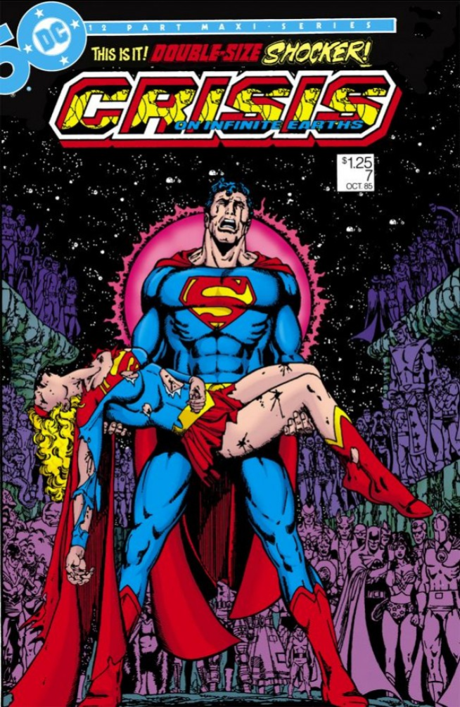
Comic: CRISIS ON INFINITE EARTHS #7
Artist: George Perez
… Is not quite unique in its composition.
You probably guessed that I jumped ahead and picked a ton of potential covers for future editions Superficial Saturdays, and CRISIS ON INFINITE EARTHS #7, with its teary-eyed Superman clutching the body of his fallen opposite number, seemed like a perfect choice. Super famous, produced by the pencil of Perez — one of the genre’s all-time greats; it has everything you could ever want in a cover (including Batman, Wonder Woman, Blue Beetle, Elongated Man, Nightwing, and dozens of other heroes in the background)…
Only..
[make your own determination]
When I Tweeted about Superficial Saturdays the first time around last week, various of my friends and followers went crazy on social media looking up possible contributions. My podcast partner Brian David-Marshall tagged one as maybe the all-time most ripped off. From five years before CRISIS ON INFINITE EARTHS, I give you John Byrne’s cover from THE DARK PHOENIX SAGA:
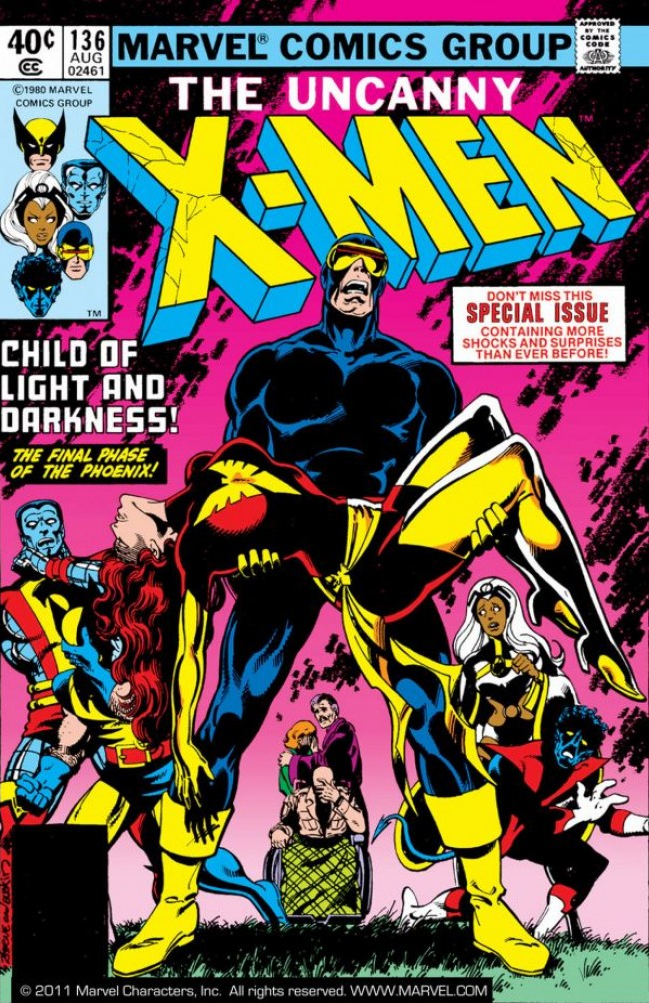
Comic: UNCANNY X-MEN #136
Artists: John Byrne and Terry Austin
In the summer of 1980, Cyclops — also crying underneat the ruby quartz visor — was clutching the body of his fallen lady love Jean Grey nearly a half-decade before Kal-El and his Kara Zor-El. I <3 and super respect George Perez as one of the all-time greats, but it's kind of hard to miss the resemblance.
One of the things that I have loved so far about this new feature / process is rediscovering the amazing work of a younger John Byrne. When I first started collecting comics seriously in the late 1980s, AVENGERS WEST COAST was one of only two comic books I bought every month (at the onset); a book that was both written and drawn by Byrne. I fell in love with SHE-HULK with Byrne breaking the fourth wall. Byrne in the 1980s was easily one of the best two or three artists in the entire industry, and his Marvel stuff wasn't even Byrne at his best.
More Superficial Saturdays recommendations in the comments please Please
PLEASE!
LOVE
MIKE
July 6th, 2013 — Comics, Superficial Satudays
I decided to start a new feature here on Five With Flores, dedicated to cool / beautiful / paper-pushing comic book covers.
Most of the discussion you’ll hear from me RE: comics is from the Alan Moore / Brian K. Vaughan / Jonathan Hickman side, but comics is more than just engaging stories, clever puns, and slavish devotion to the history of the genre… What makes comics such a unique art form is the combination of great stories and great art… And lots of that art is devoted to — you guessed it — the cover.
I decided to start this feature off with my all-time favorite piece of comics art, the cover to FABLES #71 by James Jean:
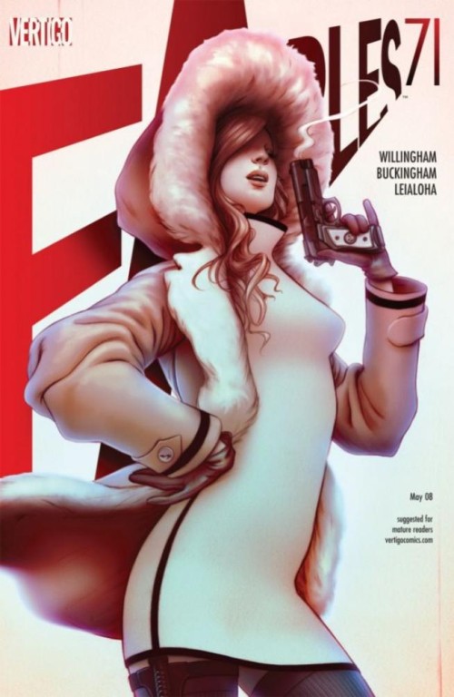
Comic: FABLES #71
Artist: James Jean
The subject of this piece is glass slipper princess Cinderella (though if you are not a regular FABLES reader you probably never would have guessed that). Bill Willingham’s re-imagination of popular storybook characters like Snow White and The Big Bad Wolf in the modern era has some of them taking on vastly different roles than you might be familiar with. Cindy in FABLES is a secret agent.
Rockwell-level draftsmanship aside, there is basically one thing that I love about this piece above all others, and that is the detail to Cindy’s right garter. All the details in the outfit, the smoke spiraling up, the feathering on her hood are great, but artists have so much opportunity to phone it in around the edges — literally a spot that, with the right cropping, could get covered up with a bar code — but Jean’s implementation here, the sliver of skin, the lighting, shows you how much effort he must put into basically everything.
I love essentially every choice Jean makes on this one; like I said, it is probably my all-time favorite piece of comics art.
I would guess that FABLES #71 holds a special place in the artist’s heart as well. He dedicated a blog post to its conception and development over on his blog: FABLES 71.
If you ever want to gun me a lavish present, if there is one high-end print or piece of original art I would ever want, it’s this one. You know, if you are ever in the market for that sort of thing 🙂
LOVE
MIKE
P.S. If you have any comics covers you love, please share them in the comments; I am going to make a super duper long-term effort to keep this a weekly feature indefinitely. Love to hear all of your input!