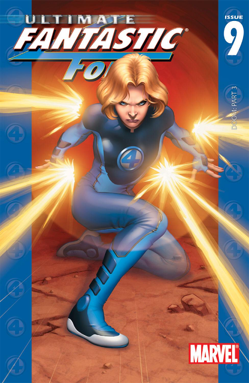
Comic: ULTIMATE FANTASTIC FOUR #9 Artist: Stuart Immonen
This will probably be an atypically long — and maybe atypically political — edition of Superficial Saturdays.
Which might be surprising given this unambiguously awesome cover of Sue Storm.
I like so many things about this cover; even though Sue’s force field power is generally depicted as a defensive weapon, we get to see some energy; and even though Sue is ostensibly “blocking” you can see that she’s getting angry and is probably winding up to kill someone to death (or you know, batter them with invisible force field balls or whatever).
The force field power is meant to be “invisible” and Immonen does a handsome job of it. We can both get the gist of the circular shield she is calling up at the same time we can see all the way through; ergo he accomplishes a pretty difficult task of conveying invisibility and invisible shield-dom, which, if you think about it, is not easy at all.
Further, Immonen’s depiction of Sue and her uniform are basically perfect. As Ultimate Sue Storm we are looking at a younger woman; and a generally young super-scientist. But per the essentially evergreen depiction of the classic Fantastic Four uniform, she is covered top to bottom; and it is a uniform. One of the things I’ve always loved about the FF is that they all wear the same thing (other than Ben Grimm) with generally little variation and it makes sense for their team and family aesthetic. Immonen’s fabric wrinkles are great and in particular how he deals with Sue’s breasts is basically perfect. Yes, this is a skin tight / form fitting uniform. Yes, there are a woman’s breasts under there. And yes, they are flattened to a degree by the uniform rather than jutting out ridiculously. Unstable molecules or no, that’s how fabric works.
Also my wife was walking by while I started writing this and said this would have been a hell of a shoe ad.
Regardless, it’s a hell of a cover.
ULTIMATE FANTASTIC FOUR #9 came out about a decade ago, and — at least cover-wise — it was awesome (I think you will agree). All the things that make sense / are awesome about the execution of this cover… I want you to hold those in your head while we dial back another ten years (a series of covers are kinda sorta the impetus of my writing this particular Superficial Saturdays).
To that end maybe the rest of this will be a mite unfair, because 1993 or so was a weird time for the comics industry.
It was spitting distance from the X-plosion of Rob Liefeld and Jim Lee with their X-FORCE and [adjective-less] X-MEN launches circa 1990. It was also quite close to the Marvel exodus of superstars Liefeld, Lee, MacFarlane, Silvestri, and others for Image Comics. Marvel was on the wrong side of a talent drain and was clearly reacting to troubling market forces.
But I can’t say I particularly like some of those reactions.
To that end I want to highlight some FF stuff I didn’t like from that era. First let’s look at FANTASTIC FOUR #371.
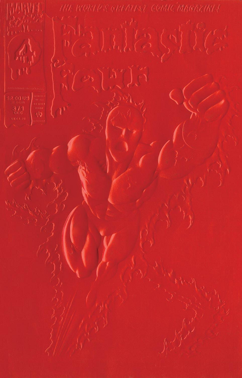
FANTASTIC FOUR #371 featured red and / or white special embossed covers. I don’t know how you feel about the art on this cover but that’s about as good as it looked IRL. I wouldn’t, on its own merits, be picking any of the Paul Ryan era FF comics for Superficial Saturdays.
I’d rather focus on two elements of this comic book cover:
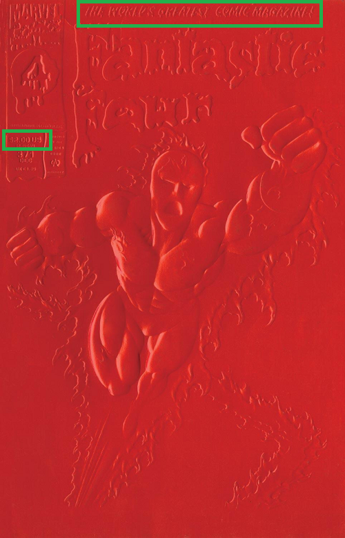
At the top we [still] have “The World’s Greatest Comic Magazine!”
When my old Comic Book Idol co-competitor Jonathan Hickman took over FANTASTIC FOUR from Mark Millar a few years ago, they didn’t let him run with that across the top. It was a big deal for Hickman to earn the banner back (and he of course put together one of the best runs of The World’s Greatest Comic Magazine, ever, and my personal favorite). Point being, that banner at the top is a big deal, or at least should be. It’s puffery to an extent; but really, Stan and Jack… John Byrne… Waid and Weiringo… It’s an awesome title to be in charge of. A dream job for a comics fan.
The other thing I want to point out on this cover is the $2.00 price tag. I mean good luck finding a $2.00 print comic book in 2014, but this was twenty years ago. The cover is… kind of shitty. They up-charged customers to $2.00 for that “embossed” shitty cover.
Let’s jump ahead to FANTASTIC FOUR #374.
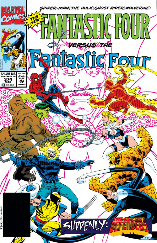
As you can see the regular price for FANTASTIC FOUR at the time was about $1.25… So paying an extra 60% for that shitty embossed cover was a pure hype move.
The bigger thing about this is how the 1993 team dealt with Sue.
Jeez-us.
The peekaboo works for Power Girl. Maybe Ahsoka Tano. But a stylized peekaboo “4” on Sue [Richards] is just atrocious.
One of the iconic things about the Fantastic Four is that they all have the same uniform. They are a family and all match. Sure, when Johnny is on fire you can’t see his blues, and Ben is a giant pile of rocks so only wears the shorts, but Reed and Sue (and Reed and Sue and Johnny) are all meant to dress alike.
Maybe. Just maybe I get sexing the title up… But it doesn’t even make sense with Sue. Forget about the fact that she’s a married woman; and a mom; there are sexy married moms. But this uniform doesn’t just seem character- and age-inappropriate, it’s hideous. It’s insulting. This woman is a science adventurer who has stared down the fundamental forces of nature. She is the once and future queen of the seven seas. She can contain an exploding supernova sun with the power of her mind and can bend the behavior of the most intelligent creature in creation to her heart. Thigh highs and a peekaboo? It’s not just ugly / insulting / inappropriate… But a betrayal of the character.
Oh, and even though you have The World’s Greatest Comic Magazine! in your hands, why not just reiterate the names of the characters on the cover? Obviously the New Fantastic Four angle with sales favorites Spider-Man, The Hulk, Ghost Rider, and Wolverine is a blatant grab for dollars based on those characters’ popularity… Why the hell would you replace “The World’s Greatest Comic Magazine!” with their names? Are we somehow banking on increasing sales based on guest characters but somehow don’t think prospective buyers know their names?
I’d like to close this section with the next issue, an anniversary issue of sorts, FANTASTIC FOUR #375:
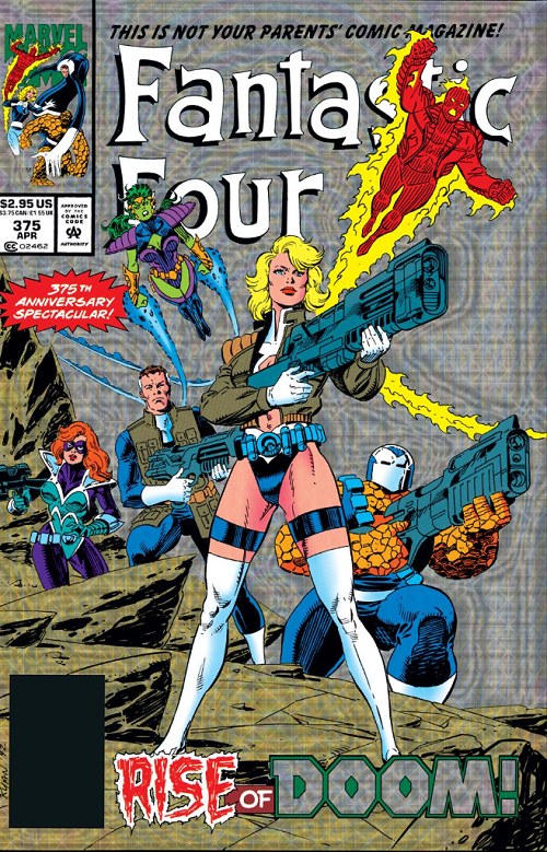
For a garish “holograhix prizm” readers get fleeced from $1.25 to $2.95 — more than 100% more than the usual price. I mean some special covers are things of beauty but this one wasn’t. It might be the worst of the three. But just four issues after the $2.00 “embossed” FANTASTIC FOUR #371? Argh.
They let us know this isn’t our parents’ comic magazine.
Not with peekaboo thigh-highs Sue front-and-center. Is this meant to be “bad”? “Bad” as in bad-girl as opposed to poorly executed? Overtly sexually exploitative? I mean if that’s the intended thrust… It isn’t even a good example of the form. Rather than dwell on whether or not we should have scantily clad superheroines at all (I think there are cases where it can be dealt with substantially better than with science-mom, like anything Emma Frost)… This cover just makes no sense.
If we are breaking Sue from the rest of the FF uniforms (you know, to show off her thighs)… Why are we covering her back up with a military jacket? Oh, all the FF match again! Except Reed doesn’t even have long sleeves! So they don’t!
WHY DO THEY ALL HAVE GUNS?
Sue Storm can suffocate a god or rip a spaceship in half with her brain. What the hell does she need a gun for? Though I am really not sure if I hate the fact that they dressed her (and Reed, and kind-of Ben) like Cable more from the story-inconsistency standpoint, or the fact that they erased all her clothes only to cover her back up again, pointlessly.
Well, at least Sue had a good, in-story reason for the costume switch. Nobody wants to look like an old frump (you know like in the Immonen cover at the top):
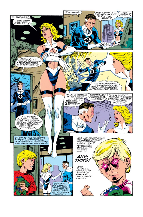
Because on the page where you introduce your Leading Lady’s well-thought-out costume change, what you really want is a coloring error ON THE SAME PAGE that misses all the skin you are supposed to be showing off.
LOVE
MIKE