January 4th, 2014 — Comics, Superficial Satudays

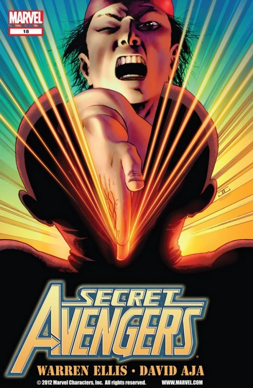
Comic: SECRET AVENGERS #18 Artist: John Cassaday
One of the thing a good cover does — especially when you hire a separate artist to do them (rather than just paying say a perfectly great interior artist) — is to really catch the eye.
Does this not catch the eye?
Are you not entertained?
I was not 100% sure what I was looking at but it looked like some ka-raz-ay em effer was karate chopping a dude’s head in half. Is that what it looks like to you? Do you not want to check out what’s going on inside?
For those of you not “in the know” this cover was one of many John Cassaday covers reuniting the award-winning artist with the writer who helped make him huge: Warren Ellis (on SECRET AVENGERS).
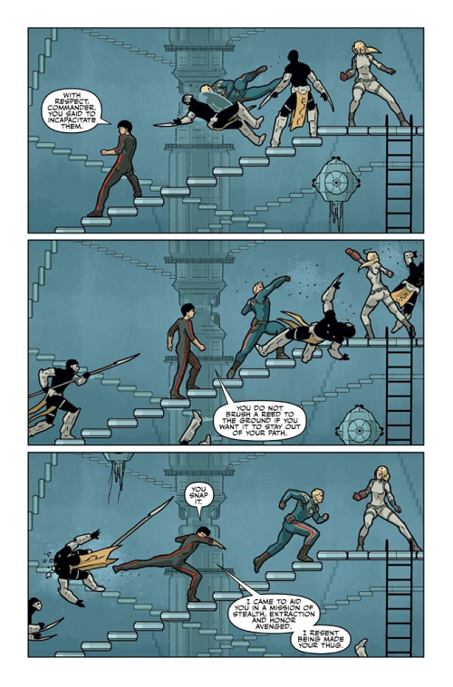
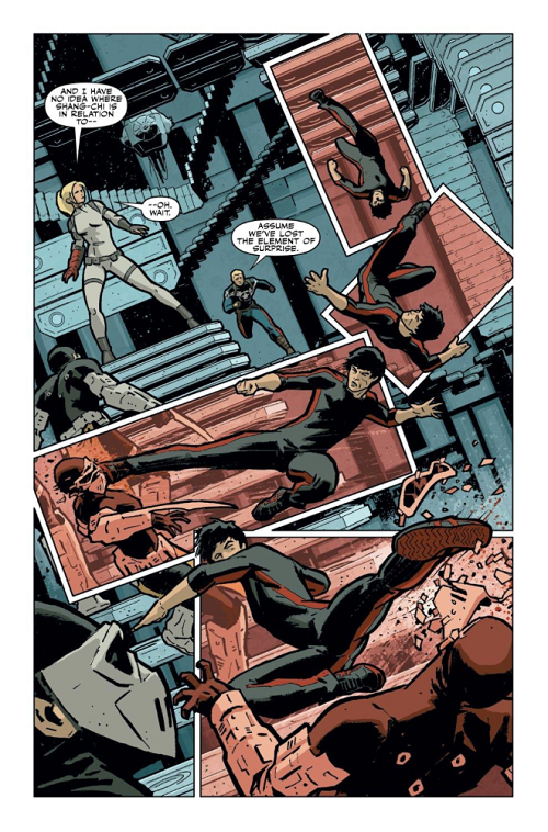
For his part, Ellis was in the midst of a SECRET AVENGERS that was kind of like the realization of everything Ellis presumably dreamed of as a kid. They were like one-of single stories a la PLANETARY (the book that first brought Ellis and Cassaday together), but he ran a rotating harem of big-name artists, one whiz-bang single at a time. Ellis tapped Jamie McKelvie from PHONOGRAM and Magic fan favorite Kev Walker; broke off a clever Alex Maleev time travel story starring Black Widow, and more. My favorite was this one, which featured David Aja from HAWKEYE and THE IMMORTAL IRON FIST for some Master of Kung-Fu martial arts action.
I know this feature is supposed to be about covers, but the internals were a treat, too.


Wouldn’t that karate chop have made you want to look inside?
LOVE
MIKE
September 28th, 2013 — Comics, Superficial Satudays

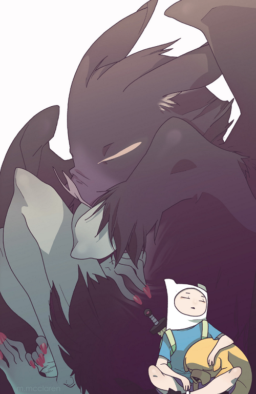
Comic: ADVENTURE TIME #16 (cover d)
Artist: Meredith McClaren
First of all this picture is just beautiful. So subtle. It would be cute and tender pic even if we didn’t know who the characters were.
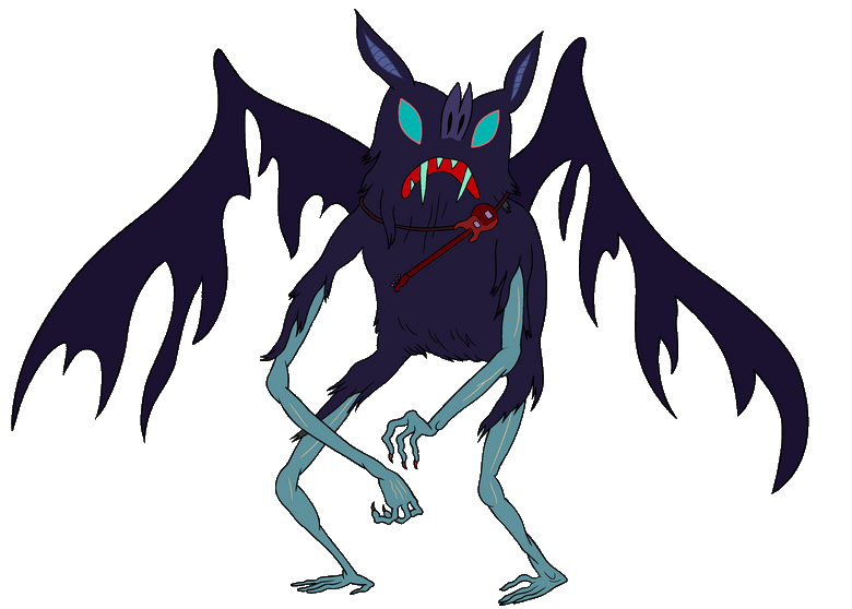
But what makes this an interesting cover to me is the un-stylized finished product. ADVENTURE TIME is known for its frankly crude illustrations. You know that giant bat the little boy and his dog are snuggling into? This is how she might look in an ep of ADVENTURE TIME:

ADVENTURE TIME goes so far out of its way to make the little boy Finn to look awkward and snaggle-toothed; his Mr. Fantastic-like dog Jake implausibly proportioned. But in McClaren’s cover, they are just a really cute kid and his dog.
Gorgeous.
LOVE
MIKE
August 24th, 2013 — Comics, Superficial Satudays
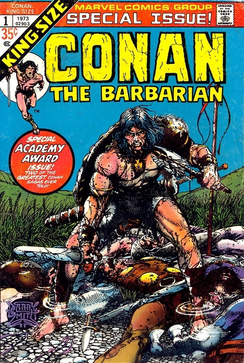
My friend and podcast partner Brian David-Marshall (once “Brian Marshall”) suggested this classic CONAN THE BARBARIAN cover by the similarly-hyphenated Barry Windsor-Smith (credited at the time as “Barry Smith”):

Comic: CONAN THE BARBARIAN ANNUAL VOL 1 #1
Artist: Barry Smith / Barry Windsor-Smith
Barry Windsor-Smith is one of my 2-5 all-time favorite comic artists. I would read his ARCHER & ARMSTRONG all day if he were still writing and drawing it. At his max level of focus, BWS’s attention to detail and line work are simply second-to-none. Keeping in mind the more limited coloring capabilities of comics in 1973 (relative to 2013), let’s run down five [with Flores] or so details that BWS could have ignored but chose to include / spend time on here…
- Conan is standing in water. He bothered to draw the little puddle effects around Conan’s ankles (and the bodies around him), triggering some slight coloring / light / shading differences above and below the wet.
- Conan’s feet / toes / toenails: BDM loves to point out certain flashy / big name artists who either don’t draw feet, mysteriously have smoke coming up around characters’ feet (so they don’t have to draw them), crop frames so they don’t have to draw the feet, or just draw feet badly. BWS? Here’s a foot — not a boot — and here’s some toenail ink while I’m at it. Eff you.
- Conan’s hair versus whatever is on his left shoulder (animal fur?)… Point being one of them you get the sense of not just length / texture / even oil… The fur or whatever is on his left shoulder is ostensibly a similar substance but using the same inks can convey this wiry or bristly texture. Most artists wouldn’t even ink individual hair details on the featured foreground figure.
- Blood – The sense of wetness he conveys with black ink on Conan’s sword and axe is basically perfect.
- The grass / wheat / fauna directly behind the characters – as in he bothered to draw in these details. In fact, the work on his long grass better than most artists’ inking of foreground characters / anything at all.
… But that’s just five or so things out of this 1973 cover.
Here’s the kicker. In big, bold, letters this annual proclaims itself full of “two of the greatest Conan sagas ever told” … which means it is a reprint issue.
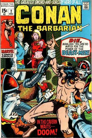
Back when he was critiquing my work on a regular basis BDM — a longtime comics editor in a previous life — would talk about a step that good artists took X pages into their careers. They would start good enough to get work and then at some point — bam! — they were at some crazy next level. BWS — “Barry Smith” back then — was the artists of the original story as well. This was what that cover looked like:

What a difference a day three years makes.
LOVE
MIKE
August 23rd, 2013 — Decks, Games, Magic
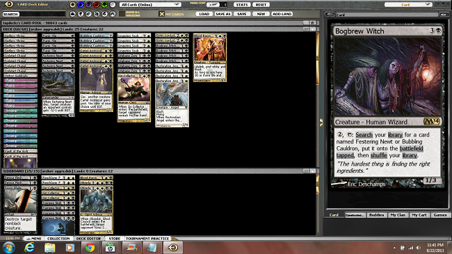
This is bar none my favorite deck in Standard right now:

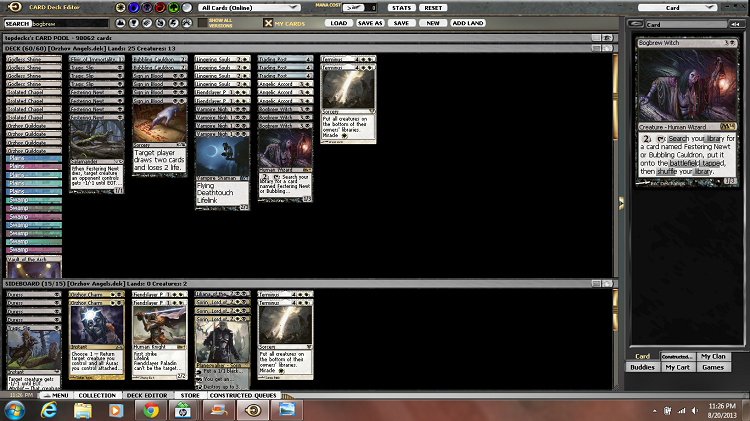
Bogbrew Beatdown
3 Bubbling Cauldron
4 Festering Newt
4 Bogbrew Witch
4 Lifebane Zombie
4 Tragic Slip
1 Blood Baron of Vizkopa
4 Cartel Aristocrat
1 Sin Collector
2 Sorin, Lord of Innistrad
4 Lingering Souls
4 Restoration Angel
4 Godless Shrine
4 Isolated Chapel
1 Orzhov Guildgate
6 Plains
8 Swamp
2 Vault of the Archangel
Sideboard
2 Devour Flesh
1 Doom Blade
4 Vampire Nighthawk
1 Blood Baron of Vizkopa
2 Obzedat, Ghost Council
3 Sin Collector
2 Fiendslayer Paladin
You may have seen a previous version of the deck on Twitter, which featured only three Bogbrew Witches main, but Skirsdag High Priest. I actually have great respect for making 5/5 Demons… But I made exactly zero, total, the whole time I was playing High Priests; I also attacked with one maybe once, though I don’t know what I was waiting for. Sin Collector has been largely better but hasn’t produced fireworks exactly; though the synergy with Restoration Angel has been pretty exciting in some matches.
I tested BDM’s more white-based Extort / Archangel of Thune deck more than any other decks of this class… But I think this one is the best of the B/W lot from a win expectation standpoint, though it of course has no Angelic Accord, which is what sent all of us down this road to begin with. You know…
“Bubbling Cauldron + Angelic Accord is basically a Batterskull.”
-YT
Brian’s deck doesn’t play the Bogbrew Witch combo, but I have grown to love those 9-12 cards tremendously over the past week or so. Though these decks can win on various dimensions I find myself becoming excited every time I can start chaining a Bogbrew With; and have had meaningful internal debates about whether I should try to stick a Witch, bait with a Restoration Angel at the end of the opponent’s turn, and the relative impact of a Witch on four versus Sorin, Lord of Innistrad. To tell you the truth, killing the opponent with just Festering Newts ain’t no joke. Sixteen you.
Festering Newt is one of the most surprising little cards you can drop on the first turn. Stromkirk Noble on the first turn has been one of the most bedeviling drops to play against for the past year and more for me; especially because my intended blockers have usually been Snapcaster Mage and Borderland Ranger… But Festering Newt is such a great answer! You can block and trade. They can remove it with Pillar of Flame, sure, but that is true for most everything; and essentially all other interaction will result in a dead Stromkirk Noble. Given the propensity of a Stromkirk Noble to get out of hand, I’m generally fine just blocking and trading one-for-one.
Lifebane Zombie is great in this deck; and overall great in the metagame. I have been stealing Boros Reckoners or Ghor-Clan Rampagers and then trading with Flinthoof Boars or Hellriders quite often. Lifebane Zombie is of course just as great with Restoration Angel as Sin Collector… Maybe better because Lifebane Zombie > Sin Collector.
The deck has a good amount of life gain, which buys a lot of time against aggro. It does not have a huge amount of lasting power against control, though; if you don’t keep your Bogbrew Witch around for a couple of untaps you are liable to run out. That is the struggle with this version, which has o Sign in Blood and no Angelic Accord. Sam Black suggested Dark Prophecy, rather said he didn’t think 0 in 75 was possibly right. Possibly he is right! Dark Prophecy would surely give the deck some lasting power against control, or in attrition matchups.
Anyway, just wanted to share this.
Like a lot of pleasantly surprised bogBrewers, I didn’t expect I would be playing many Bubbling Cauldrons in Standard but the combo has been very effective. It is just fantastic against aggro decks that want to race you as well as removal-poor midrange creature decks. Though this strategy can very likely be improved, it is going to be my jumping off point come the impending Theros rotation.
LOVE
MIKE

August 20th, 2013 — Decks, Magic, Podcasts

Angelic Accord, version 1.0
2 Bubbling Cauldron
1 Elixir of Immortality
3 Trading Post
3 Bogbrew Witch
4 Festering Newt
4 Sign in Blood
3 Tragic Slip
4 Vampire Nighthawk
3 Angelic Accord
2 Fiendslayer Paladin
4 Lingering Souls
2 Terminus
4 Godless Shrine
4 Isolated Chapel
4 Orzhov Guildgate
5 Plains
7 Swamp
1 Vault of the Archangel
Sideboard
3 Sorin, Lord of Innistrad
2 Fiendslayer Paladin
2 Orzhov Charm
1 Tragic Slip
4 Duress
2 Terminus
1 Liliana of the Dark Realms
For anyone wondering about the deck BDM and I were talking about in the most recent podcast the above is it.
I don’t want to spend a huge amount of time talking about the strategies, plans, and angles various on this deck as it ended up being a bit less than super awesome; but as BDM raved in the podcast it is fun to play, [presumably] fun to watch, and capable of some pretty exciting comebacks.
If you brave yourself up to give Angelic Accord a swing, keep these things in mind:
- Trading Post + Angelic Accord is the basic combo. Once you have both of these in play, it is rare that you will do anything but discard to Trading Post every turn. But be careful! You have to discard before the opponent’s end step if you want to crash with a new 4/4 on your turn.
- Bubbling Cauldron + Angelic Accord is basically a Batterskull. Almost anything can catalyze the first 4/4 Angel. You can crash on your turn, sacrifice the Angel, gain four, and net a fresh (untapped) Angel to block on your opponent’s turn. Okay, I’ll bite… It is probably a bit better than a Batterskull. Ya got me.
- Elixir of Immortality allows you to loop your Festering Newts. The limit on the Bogbrew Witch combo is that you can only search up four Festering Newts. But if you can put your Festering Newts back into your deck, you break the normal limit on Bogbrew Witch. I don’t know if you’ve played much Bogbrew Witch in Standard, but the other two halves of the combo win a lot of games for me. Somehow… A real thing.
- You can activate life gain abilities on both your turn and your opponent’s turn in order to trigger a single Angelic Accord twice per cycle. Truth.
Did I mention there is a new Top8Magic podcast up on ManaDeprived? Well there is! And BDM is back!
If you are somehow too lazy to click one of the several links to ManaDeprived on this page / in this post, I suppose you can listen to the cast here:
(I suppose.)
Hope you <3 it!
LOVE
MIKE

August 17th, 2013 — Comics, Superficial Satudays
Just got back from watching KICK-ASS 2 at the movies.
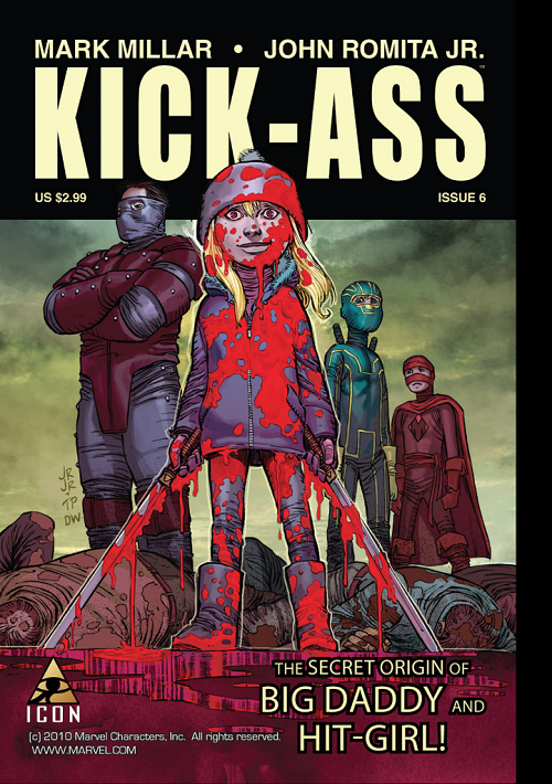
In honor of this weekend’s soon-to-be blockbuster sequel, maybe the most arresting cover from the original KICK-ASS:

Comic: KICK-ASS #6
Artists: John Romita, Jr. (pencils) and Tom Palmer (inks)
What have we got here?
I figure most of us — at least those even passingly familiar with KICK-ASS as a property — are desensitized to the ultra-violence of it. But probably at some point in our pasts an image like the cover to KICK-ASS #6 would have demanded a double-take.
A little girl, drenched in blood, a sword in either hand; standing over the bodies of fallen men. Can you say “juxtaposition”?
The girl is Hit-Girl (as the cover indicates); possibly the most important unique element of the KICK-ASS franchise; a little girl who is a deadly killer. Foul-mouthed as she is lethal, Hit-Girl is actually what made me fall in love with the original movie. And here we have her origin story! (or at least the lower-right-hand-corner claims)
KICK-ASS isn’t for everyone, certainly. I “get” what Millar and Romita (and later Vaughn) were getting at with this. If you understand where they were trying to go, I think there is really only one reading: whiz-bang smashing success. KICK-ASS is the PULP FICTION of superheroes. It is a straight story; not a satire… But it constantly forces you to look twice and think twice, even challenge your suspension of disbelief.
But yeah, even someone who gets it — and buys in — has to think a second over Hit-Girl’s smile in this one… Especially as the titular ass-kicker looks on horrified from behind.
LOVE
MIKE
August 10th, 2013 — Comics, Superficial Satudays
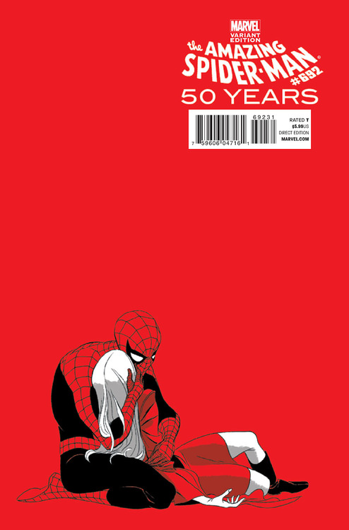
For the 50th anniversary of [arguably] Marvel Comics’s favorite character the House of Ideas commissioned superduperstar artist Marcos Martin to scribble up a number of variant covers, and man were they gorgeous. Jonathan Becker of “Tomfidence” fame brought these to my attention for Superficial Saturdays. Here is my favorite of the set “the 1970s variant”:

Comic: AMAZING SPIDER-MAN #692
Artist: Marcos Martin
Anyone familiar with Spider-Man’s history knows about the Death of Gwen Stacy; Peter’s true love was murdered by his archenemy the Green Goblin in one of the most famous no-win situations in comics. Martin’s homage is just perfect in my estimation. Despite the dominance of negative space, I think this is a very well-composed image.
The use of color in this image is just… brave. I love flat color but this is just extreme. The red of the background is the same as the red of Spidey’s suit is the same as the red of Gwen’s outfit [and if memory serves she was wearing a green coat in the original]. I love how he uses the limited color palette to imply Gwen’s death. She is all white and gray… Like a ghost.
Goes without saying that the line work on this one is just outstanding. And versatile. You can tell that both images are Marcos Martin but he uses a completely different line than we saw in GREEN ARROW #40. Thanks to Becker; just love this one.
LOVE
MIKE
August 7th, 2013 — Magic, Podcasts
MichaelJ:
Well BDM was off at the World Championships last weekend so I did a fill-in podcast with the incomparable Innovator Patrick Chapin over on ManaDeprived.
The only problem is… For the second consecutive week, we got Kalonian Hydra for our banner! Boo-urns!
On the bright side, KYT and company replaced the Top 8 Magic entrance music with a piece pilfered from the princess of pottymouthed chick rockers, Liz Phair. Yay! As such, here might have been a possible awesome banner:

Okay, maybe that doesn’t scream “Magic: The Gathering” or even [accurately] that Brian David-Marshall is on this podcast.
How about this one, thematic of NLDB and Patrick’s guest appearance?

Yeah, yeah… Not quite as beautiful as the cover design on NLDB… But I tried! (not very hard) Fine. You want to see “didn’t try very hard”?

So… No. Gotcha.
How about the classics then?

Or bringing back to NLDB (stole this image from NLDB in part, in fact), and the whole “me and Patrick talking on the phone” aspect?

Reader / Listener / Beloved Customer:
Hold up, did you just say you did a new podcast, and that it was guest-starring Patrick Chapin?
MichaelJ:
Yes!
Reader / Listener / Beloved Customer:
Whatever dude. Carry on. No one cares about Kalonian Hydra re-run banners or intro music. I’ll be over on ManaDeprived listening to Deck Building and Life with Patrick Chapin thank you very much.
MichaelJ:
Um… Sweet?
Subscribe to the Top8Magic Podcast (usually starring Brian David-Marshall)
LOVE
MIKE

August 3rd, 2013 — Comics, Superficial Satudays
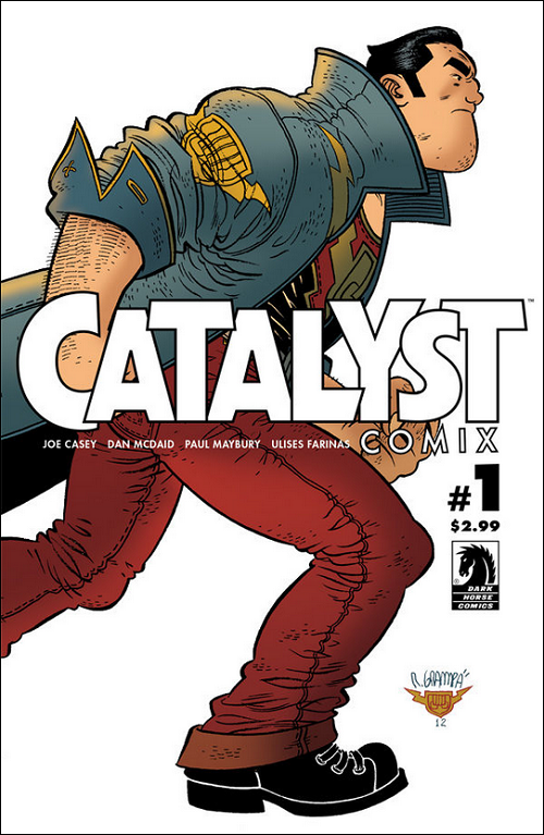
I was actually clicking around some comics websites looking for news updates on some of my favorite Image books [that haven’t come out in forever], HELL YEAH and DANGER CLUB, and I just saw a banner ad for CATALYST COMIX out of Dark Horse (which was more-or-less a cutaway of the below #1 cover).
I thought it was gorgeous… Kind of like a cross between Geoff Darrow (or maybe P. Craig Russell on SANDMAN) and Popeye cartoons.
So here’s the criteria…
- Banner ad for a [book?] I had never heard of… And who clicks banner ads anyway?
- Not only was it disruptively engaging, eye-catching, and in my opinion gorgeous…
- I even wrote a blog post about it!
Success!
Success?

Comic: CATALYST COMIX #1
Artist: Rafael Grampá
Though the Popeye-esque chin on that protagonist (?) is what initially caught my eye, my favorite thing about Rafael Grampá’s cover has to be that right boot. They obviously applied computer coloring to his gorgeous, clean, cartoon-esque line work; but that boot. It’s just a huge chunk of black ink. In fact, it’s almost an eff-you to gradient color. I want to say all the detail is perfectly-applied negative space, but it actually looks like white ink (or at least white Photoshop). Love it regardless. Absolute best thing about a pretty great shot.
So (other than admiring that boot) what do I know about CATALYST COMIX?
Um… Nothing?
I know a mite about writer Joe Casey. He wrote one of my favorite comics, CODEFLESH (link is to a review I wrote on my old blog almost a Deckade ago), was responsible for the ingenious and ultimately unsuccessful WILDCATS 3.0, and is a co-creator of the character Ben 10 as a part of Man of Action; but of CATALYST COMIX, I know nothing.
But I thought the cover was engaging enough to pen these ~200 words.
If you are interested in learning more, Dark Horse has a free CATALYST COMIX preview on their website.
So… What do you think? Good enough cover for a Superficial Saturdays with no other knowledge?
LOVE
MIKE
July 29th, 2013 — Everywhere, Magic, Podcasts, Writing

Concerning:
- The Moral Victory of 16 Thumbs and 7 Toughness
- The Destiny of 4 Kalonian Hydras
- The Next Level of The Next Level
So I was gone at the Star City Games Invitational in Somerset, NJ Friday through Sunday, and basically missed a whole bunch of stuff. Some of it is important; other stuff, simply awesome. Hence, this after-the-weekend Weekend Update.
Top8Magic on ManaDeprived Update
First of all, thank all of you cats who went over and liked our first podcast on ManaDeprived, “Save or Delete”.
In case you didn’t know, we posted another podcast last Friday.
Let me ask you a question: DO YOU WANT US TO DO THESE EVERY WEEK?
Is that like asking if the world needs more TAUNTING JON BECKER?
Answer in the comments below but I assume the answer(s) is / are em effin’ yes. If so, I need y’all to click over to ManaDeprived and Like the bejeezus out of this. Our first podcast over there got 10x the usual likes of a ManaDeprived podcast, but “The Moral Victory of 16 Thumbs and 7 Toughness” has to date garnered a pathetic 3 Likes. I don’t know what kind of Up North operation KYT has at ManaDeprived but I assume his servers are made out of maple tree twigs and run on a hydraulic system of syrup and snow. Go click over to ManaDeprived and break that thing! Come on BDM fans! Let’s go!
And / or…
Listen here:
Download and listen later…
But most definite, DEFINITELY, subscribe on iTunes:
http://itunes.apple.com/ca/podcast/mana-deprived/id489782347
Kalonian Hydra Update
In case you were wondering what happened to those four Kalonian Hydras I picked up [but did not play] for the Invitational, they found a fine home in the Zvi Mowshowitz-designed G/W Elves deck piloted by our good friend William “Baby Huey” Jensen:

William Jensen with YT’s four Hydras!
G/W Elves
4 Garruk, Caller of Beasts
4 Kalonian Hydra
4 Elvish Mystic
2 Loxodon Smiter
4 Wolfir Silverheart
4 Craterhoof Behemoth
4 Avacyn’s Pilgrim
4 Gavony Township
4 Arbor Elf
4 Sunpetal Grove
4 Elvish Archdruid
4 Elvish Visionary
4 Temple Garden
10 Forest
Sideboard
4 Strangleroot Geist
2 Ranger’s Guile
3 Garruk Relentless
3 Tree of Redemption
3 Acidic Slime
Huey Made Top 8 of last week’s Standard Open with U/R/W Control but did poorly in the Invitational. He switched it up to the G/W deck for the Somerset Standard Open and crushed his way all the way to second place. I have thought about playing against this deck with a variety of strategies and I think it is both counterintuitive and tough from the control side. At first glance this is the classic deck you crush with Ratchet Bombs and Supreme Verdicts but I don’t think it is ultimately that cut-and-dried. You can’t screw up. You can’t give them operating mana for too long. You certainly can’t let them level up repeatedly with Garruk, Caller of Beasts. I played a Quicken + Planar Cleansing deck in the Invitational and Open specifically to crush Jund decks that had been accumulating Planeswalker-based battlefield advantages but I don’t think that works against Garruk-six. The last thing you want to do is to tap for Planar Cleansing, clearing their board… But leaving them with seven cards in hand (most of which are sweet threats).
I actually think that you want both lots of sweep but need Need NEED permission to fight Garruk, Caller of Beasts here. I would consider siding in Negate just to fight that six. The creatures are not particularly resilient exclusive of dealing massive damage in one big attack. You really need to keep them off their combination of acceleration and card advantage or you are going to eat a Craterhoof, I fear.
Anyway, great weekend for Huey, who made back-to-back Standard and Legacy Open Top 8s.
NEXT LEVEL DECKBUILDING Update
Are you living under a rock or something?
Biggest of the big that happened this past weekend was the release of Patrick Chapin’s new book NEXT LEVEL DECKBUILDING on Star City Games. Patrick is one of my best friends and as a writer, an inspiration. He was one of the driving forces that got me off my butt to do THE OFFICIAL MISER’S GUIDE and I wish him all the luck with NEXT LEVEL DECKBUILDING.
NEXT LEVEL DECKBUILDING is huge — some 472 pages — but I haven’t been able to put it down all day. It’s beautifully laid out by the ebook elves at Star City Games; the content is one-of-a-kind and often quite hilarious (more on that later in the week). I haven’t read it all yet but I am absolutely loving much of what I have so far. Don’t go out and immediately buy NEXT LEVEL DECKBUILDING before you buy THE OFFICIAL MISER’S GUIDE or anything silly like that; but if you are in the market for awesome Magic books… This one is pretty awesome. I’m going to be recommending this for years I think. Again, more deets later.
Okay friends!
Lots of stuff to do!
Action Items!

LOVE
MIKE
