Entries Tagged 'Superficial Satudays' ↓
May 11th, 2014 — Comics, Superficial Satudays
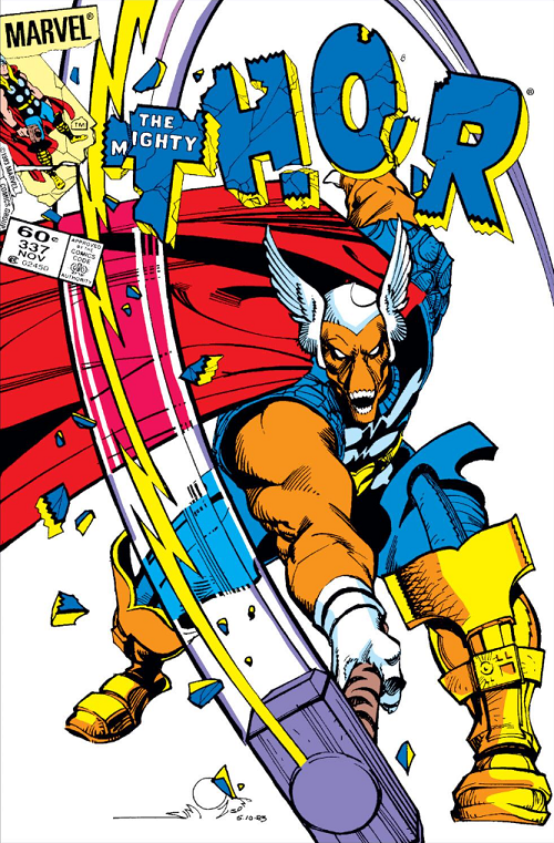
Comic: THE MIGHTY THOR #337 Artist: Walt Simonson
I was hanging out with Matt Wang today [okay yesterday now] and told him I wanted to do something old school for Superficial Saturdays; he suggested this high impact cover from Walt Simonson.
Forget for a moment the look and execution of this cover and instead just look at what is being depicted.
This is a monster swinging Thor’s magic hammer!
Do you remember this scene from Joss Whedon’s blockbuster movie?
The Hulk — the strongest one there is — can’t budge Mjolnir.
A defining piece of the Thor mythos, Mjolnir can only be lifted by those of particular strength and especial moral worth. Captain America has been able to pick it up on occasion (and most recently led an Odin-powered Avengers team with Mjolnir when Thor was down during Fear Itself)… But almost no one else.

This guy, sure; good AND strong.
So seeing a monster not just swinging Mjolnir — but busting the Thor logo — was a big, big game. This was, if memory serves, the first issue of Walt Simonson’s defining run on THE MIGHTY THOR. Simonson wanted to do something different, really put hit stake in the ground, and the idea of someone else picking up the magic hammer to challenge Thor was the way he went.
The cover was shocking… And memorable enough that we are talking about it three decades later!
Plus, I think it’s pretty cool looking!
Simonson can be an acquired taste; his art isn’t for everyone (in particular comics dilettantes), but there is no mistaking him for anyone else, or anyone else for him. The cartoon lightning bolt. The flat color. The exaggerated motion. The audacity around the logo. So many things to love.
LOVE
MIKE
May 2nd, 2014 — Comics, Superficial Satudays
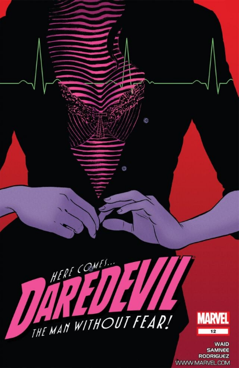
Comic: DAREDEVIL #12 Artist: Paolo Rivera
Mark Waid’s 2011 reboot of DAREDEVIL (DAREDEVIL volume three) has had no shortage of acclaim… Or acclaimed artists. The book itself was unapologetic old-school fun, and well-written without approaching some of Waid’s more epic superhero work (say KINGDOM COME, or even FLASH)… But that didn’t stop it from being basically the best mainstream superhero book in the spinner racks for the past three years.
A big part of that was that aforementioned succession of superior artists… Paolo Rivera, Marcos Martin, and of course Chris Samnee working in similar, stylized, and high-velocity styles. Samnee is the most associated with the book, eventually pocketing an Eisner Award, but it launched with Rivera, who put up quite a few covers even after he quit internals… including this #12 (which featured Samnee interiors). And in case you were wondering, I buy basically everything that Marcos Martin or Chris Samnee draw.
What’s great about this cover?
It’s super stylized. Marvelously minimal. Flat color; bold design decsions; essentially the anti-1990s.
Despite being defined by big chunks of black or negative space, Rivera does a masterful job with the figure’s hands. They are elegant in execution and telling a story of their own that is almost set apart from the other 75% of the piece.
And speaking of telling a story… ?
What’s with all those lines?
This cover shot is from Daredevil’s POV. Daredevil is blind, and “sees” with a superhuman radar sense. He can “see” the bounce and curve of DA Kirsten McDuffie’s breasts… And the uneven rendering in fact tells us that they are where Daredevil is putting his focus. We even get that radar-esque lines-styling across the top one-third of the image (and with some color contrast) to make sure that we share Daredevil’s focus.
Rivera makes a masterful number of choices here. Daredevil can’t see color, so everything cloth is just black. Kirsten’s shirt is black. Her — is it a skirt? — is all black. We can’t tell, color-wise, where a top ends and another piece of clothing begins. But Daredevil can observe texture, so we get some detail around both her buttons, and some varying design and direction making up her bra… In part because Daredevil himself is “staring” at at.
And yet Rivera draws Kirsten’s hands same-old same-old. No radar styling… They even get some different color treatment. Movement; slightly nuanced color treatment [instead of flat color]. We already said they tell a story of their own. Why?
It looks cool?
That isn’t where Daredevil is putting his focus [so the artist is making it simpler for readers]?
Composition?
Ah, “why” questions.
For me, it’s cool enough that all this, all together looks cool. It’s sexy without being ridiculous; and harnesses a fair number of storytelling limitations and turns them into unique design elements.
Which is all-and-all masterful; at least in this writer’s opinion.
LOVE
MIKE
April 26th, 2014 — Comics, Superficial Satudays
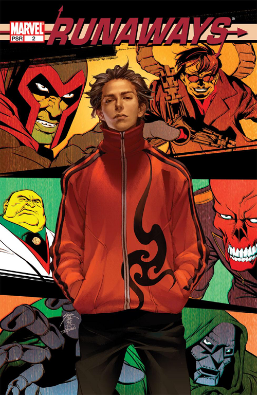
Comic: RUNAWAYS #2 Artist: Jo Chen
Nothing too much to say here, other than I really like the composition of this cover. Not a huge surprise that Jo Chen did a good job on a comics cover (she is widely considered one of the best cover artists in the industry and a former Eisner nominee)… But this is a probably my favorite of her many detailed covers.
What I like in particular on this piece is the contrast of two styles that you rarely see side-by-side.
Victor Mancha in the foreground is depicted in the usual nuanced, almost photo-realistic, Chen cover style.
The background villains — Magneto, Dr. Octopus, Kingpin, Red Skull, and Dr. Doom — are depicted in a Kirby-reminiscent style with flat colors. I think they two harmonize well here, and make for something different,.
I hope you like it as well.
LOVE
MIKE
April 19th, 2014 — Comics, Superficial Satudays
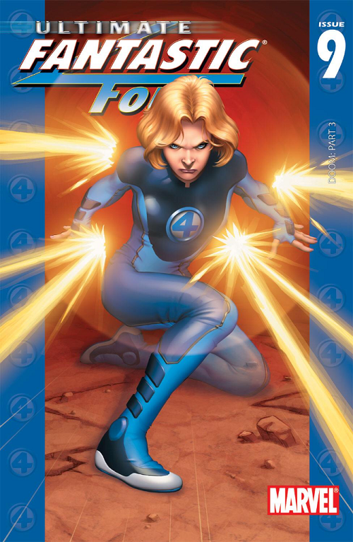
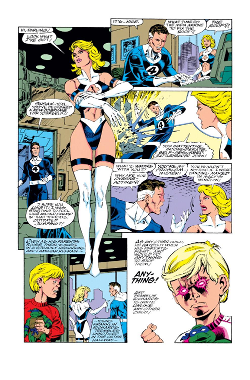
Comic: ULTIMATE FANTASTIC FOUR #9 Artist: Stuart Immonen
This will probably be an atypically long — and maybe atypically political — edition of Superficial Saturdays.
Which might be surprising given this unambiguously awesome cover of Sue Storm.
I like so many things about this cover; even though Sue’s force field power is generally depicted as a defensive weapon, we get to see some energy; and even though Sue is ostensibly “blocking” you can see that she’s getting angry and is probably winding up to kill someone to death (or you know, batter them with invisible force field balls or whatever).
The force field power is meant to be “invisible” and Immonen does a handsome job of it. We can both get the gist of the circular shield she is calling up at the same time we can see all the way through; ergo he accomplishes a pretty difficult task of conveying invisibility and invisible shield-dom, which, if you think about it, is not easy at all.
Further, Immonen’s depiction of Sue and her uniform are basically perfect. As Ultimate Sue Storm we are looking at a younger woman; and a generally young super-scientist. But per the essentially evergreen depiction of the classic Fantastic Four uniform, she is covered top to bottom; and it is a uniform. One of the things I’ve always loved about the FF is that they all wear the same thing (other than Ben Grimm) with generally little variation and it makes sense for their team and family aesthetic. Immonen’s fabric wrinkles are great and in particular how he deals with Sue’s breasts is basically perfect. Yes, this is a skin tight / form fitting uniform. Yes, there are a woman’s breasts under there. And yes, they are flattened to a degree by the uniform rather than jutting out ridiculously. Unstable molecules or no, that’s how fabric works.
Also my wife was walking by while I started writing this and said this would have been a hell of a shoe ad.
Regardless, it’s a hell of a cover.
ULTIMATE FANTASTIC FOUR #9 came out about a decade ago, and — at least cover-wise — it was awesome (I think you will agree). All the things that make sense / are awesome about the execution of this cover… I want you to hold those in your head while we dial back another ten years (a series of covers are kinda sorta the impetus of my writing this particular Superficial Saturdays).
To that end maybe the rest of this will be a mite unfair, because 1993 or so was a weird time for the comics industry.
It was spitting distance from the X-plosion of Rob Liefeld and Jim Lee with their X-FORCE and [adjective-less] X-MEN launches circa 1990. It was also quite close to the Marvel exodus of superstars Liefeld, Lee, MacFarlane, Silvestri, and others for Image Comics. Marvel was on the wrong side of a talent drain and was clearly reacting to troubling market forces.
But I can’t say I particularly like some of those reactions.
To that end I want to highlight some FF stuff I didn’t like from that era. First let’s look at FANTASTIC FOUR #371.
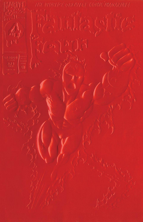
FANTASTIC FOUR #371 featured red and / or white special embossed covers. I don’t know how you feel about the art on this cover but that’s about as good as it looked IRL. I wouldn’t, on its own merits, be picking any of the Paul Ryan era FF comics for Superficial Saturdays.
I’d rather focus on two elements of this comic book cover:
At the top we [still] have “The World’s Greatest Comic Magazine!”
When my old Comic Book Idol co-competitor Jonathan Hickman took over FANTASTIC FOUR from Mark Millar a few years ago, they didn’t let him run with that across the top. It was a big deal for Hickman to earn the banner back (and he of course put together one of the best runs of The World’s Greatest Comic Magazine, ever, and my personal favorite). Point being, that banner at the top is a big deal, or at least should be. It’s puffery to an extent; but really, Stan and Jack… John Byrne… Waid and Weiringo… It’s an awesome title to be in charge of. A dream job for a comics fan.
The other thing I want to point out on this cover is the $2.00 price tag. I mean good luck finding a $2.00 print comic book in 2014, but this was twenty years ago. The cover is… kind of shitty. They up-charged customers to $2.00 for that “embossed” shitty cover.
Let’s jump ahead to FANTASTIC FOUR #374.
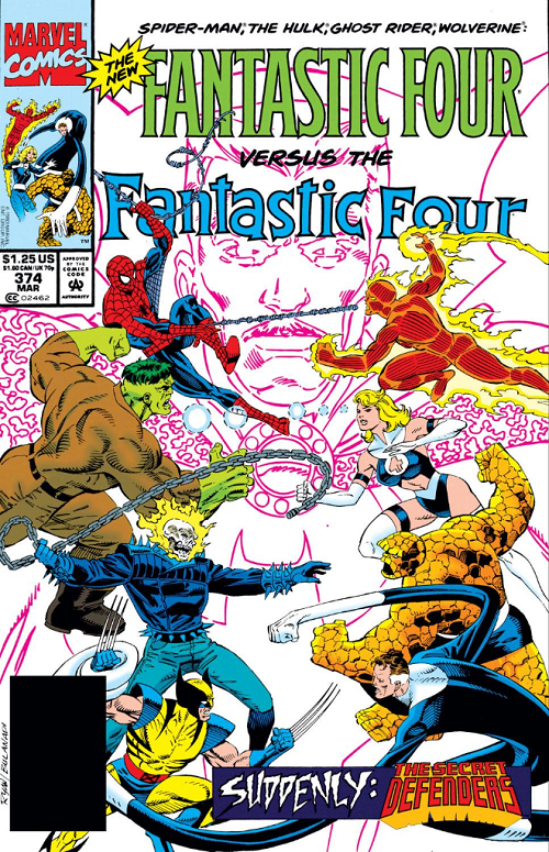
As you can see the regular price for FANTASTIC FOUR at the time was about $1.25… So paying an extra 60% for that shitty embossed cover was a pure hype move.
The bigger thing about this is how the 1993 team dealt with Sue.
Jeez-us.
The peekaboo works for Power Girl. Maybe Ahsoka Tano. But a stylized peekaboo “4” on Sue [Richards] is just atrocious.
One of the iconic things about the Fantastic Four is that they all have the same uniform. They are a family and all match. Sure, when Johnny is on fire you can’t see his blues, and Ben is a giant pile of rocks so only wears the shorts, but Reed and Sue (and Reed and Sue and Johnny) are all meant to dress alike.
Maybe. Just maybe I get sexing the title up… But it doesn’t even make sense with Sue. Forget about the fact that she’s a married woman; and a mom; there are sexy married moms. But this uniform doesn’t just seem character- and age-inappropriate, it’s hideous. It’s insulting. This woman is a science adventurer who has stared down the fundamental forces of nature. She is the once and future queen of the seven seas. She can contain an exploding supernova sun with the power of her mind and can bend the behavior of the most intelligent creature in creation to her heart. Thigh highs and a peekaboo? It’s not just ugly / insulting / inappropriate… But a betrayal of the character.
Oh, and even though you have The World’s Greatest Comic Magazine! in your hands, why not just reiterate the names of the characters on the cover? Obviously the New Fantastic Four angle with sales favorites Spider-Man, The Hulk, Ghost Rider, and Wolverine is a blatant grab for dollars based on those characters’ popularity… Why the hell would you replace “The World’s Greatest Comic Magazine!” with their names? Are we somehow banking on increasing sales based on guest characters but somehow don’t think prospective buyers know their names?
I’d like to close this section with the next issue, an anniversary issue of sorts, FANTASTIC FOUR #375:
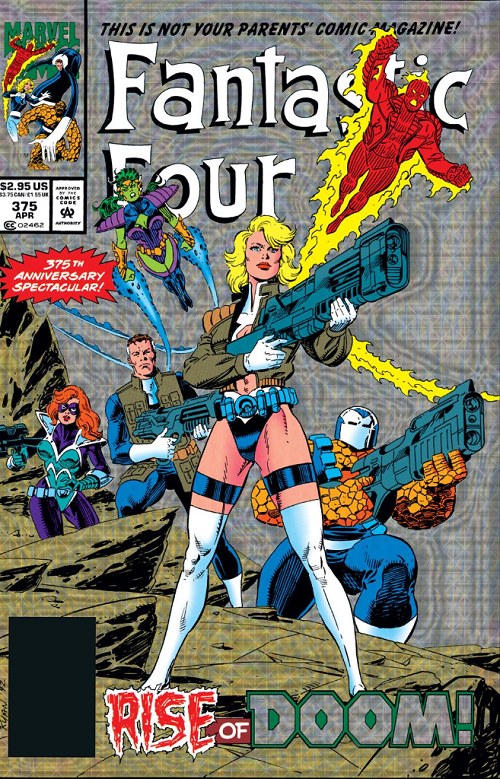
For a garish “holograhix prizm” readers get fleeced from $1.25 to $2.95 — more than 100% more than the usual price. I mean some special covers are things of beauty but this one wasn’t. It might be the worst of the three. But just four issues after the $2.00 “embossed” FANTASTIC FOUR #371? Argh.
They let us know this isn’t our parents’ comic magazine.
Not with peekaboo thigh-highs Sue front-and-center. Is this meant to be “bad”? “Bad” as in bad-girl as opposed to poorly executed? Overtly sexually exploitative? I mean if that’s the intended thrust… It isn’t even a good example of the form. Rather than dwell on whether or not we should have scantily clad superheroines at all (I think there are cases where it can be dealt with substantially better than with science-mom, like anything Emma Frost)… This cover just makes no sense.
If we are breaking Sue from the rest of the FF uniforms (you know, to show off her thighs)… Why are we covering her back up with a military jacket? Oh, all the FF match again! Except Reed doesn’t even have long sleeves! So they don’t!
WHY DO THEY ALL HAVE GUNS?
Sue Storm can suffocate a god or rip a spaceship in half with her brain. What the hell does she need a gun for? Though I am really not sure if I hate the fact that they dressed her (and Reed, and kind-of Ben) like Cable more from the story-inconsistency standpoint, or the fact that they erased all her clothes only to cover her back up again, pointlessly.
Well, at least Sue had a good, in-story reason for the costume switch. Nobody wants to look like an old frump (you know like in the Immonen cover at the top):
 Because on the page where you introduce your Leading Lady’s well-thought-out costume change, what you really want is a coloring error ON THE SAME PAGE that misses all the skin you are supposed to be showing off.
LOVE
MIKE
April 12th, 2014 — Comics, Superficial Satudays
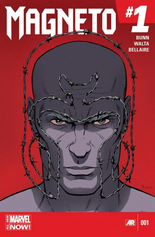
Comic: MAGNETO #1 Artist: Paolo Rivera
This is a relatively recent cover (maybe two months young) RE: a new-look Magneto.
I’ve always thought of Magneto as an A-list and relatively interesting villain; but Magneto in recent years has been characterized as if not a superhero, the consigliere to longtime X-Men leader Scott Summers. That said, I’ve never really bought Magneto as an interesting hero figure. He’s done quite a few bad things — repeated genocidal attempts on the human race on the far end, ripping Wolverine to pieces on a nice day… I just have a hard time wanting to buy a comic book about him as a good guy.
Which is what makes this cover interesting.
This is a great, stark, image; it’s engaging… If I saw it in the comic book store I would pick it up and give it a look.
That isn’t particularly surprising, of course. This is Paolo Rivera! Rivera is one of the best artists — and especially cover artists — in the Marvel stable. He’s not just good at rendering figures, but often does interesting things mixing it up as a designer.
The post-AVX Magneto is drawn as a bald man. I’ve probably missed some issue somewhere but I’m guessing that at least part of it is evoking the memory of our dear, departed Charles Xavier. Further, Magneto is generally depicted in a stylized white uniform.
What does Rivera do here?
Even though Magneto’s face / head is that of the current bald man, he reminds us of the classic Magneto helmet — in suggestive barbed wire. This is almost a juxtaposition of 2-D and 3-D imagery; I can’t actually tell. Does part of the “helmet” actually wrap around Magneto’s head? I think so; that also doesn’t make much sense in terms of the internal logic of the image.
And barbed wire?
Rivera could have chosen lots of different materials for this image; this one, despite a complete absence of regalia or insignia, hearkens back to Magneto’s childhood in WWII concentration camps. I think.
Super simple image, but expertly executed.
LOVE
MIKE
April 6th, 2014 — Comics, Reviews, Superficial Satudays
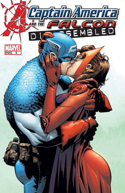
Comic: CAPTAIN AMERICA AND THE FALCON #6 Artist: Joe Bennett
I actually remember buying this issue of CAPTAIN AMERICA AND THE FALCON back in 2004 on account of the cool cover.
It’s got big swaths of primary colors, nice light and dark, and even if Cap looks kind of like a big red, white, and blue thug; Scarlet Witch is expertly rendered (for the style). Even though Wanda is way more covered up than the average girl superhero, she has an inescapable swagger in the backside. But more importantly her hands speak a language of their own. Wanda’s right hand is almost hungry. You can kind of imagine it pulling and pawing at Cap.
It’s not actually Saturday, I know. Also I haven’t done one of these in a while. But this one was in my queue for Superficial Saturdays to cover for a while, and I thought it was appropriate for the weekend. For anyone who has seen the tv commercials, you know that the Falcon is a big part of this weekend’s big movie; and for anyone following Avengers 2 news, you know that the Scarlet Witch is an upcoming character (she makes a short cameo in Winter Soldier).
For what it’s worth, I loved Captain America: The Winter Soldier quite a bit. It was a little predictable but still an absurdly good action movie and one of the best comic book superhero movies of all time. If nothing else, it inspired me to get back to these!
LOVE
MIKE
January 4th, 2014 — Comics, Superficial Satudays
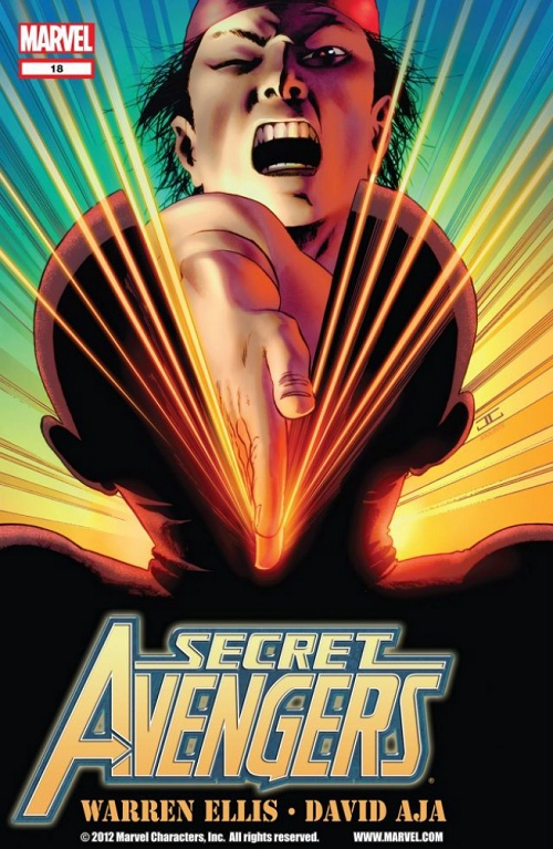
Comic: SECRET AVENGERS #18 Artist: John Cassaday
One of the thing a good cover does — especially when you hire a separate artist to do them (rather than just paying say a perfectly great interior artist) — is to really catch the eye.
Does this not catch the eye?
Are you not entertained?
I was not 100% sure what I was looking at but it looked like some ka-raz-ay em effer was karate chopping a dude’s head in half. Is that what it looks like to you? Do you not want to check out what’s going on inside?
For those of you not “in the know” this cover was one of many John Cassaday covers reuniting the award-winning artist with the writer who helped make him huge: Warren Ellis (on SECRET AVENGERS).
For his part, Ellis was in the midst of a SECRET AVENGERS that was kind of like the realization of everything Ellis presumably dreamed of as a kid. They were like one-of single stories a la PLANETARY (the book that first brought Ellis and Cassaday together), but he ran a rotating harem of big-name artists, one whiz-bang single at a time. Ellis tapped Jamie McKelvie from PHONOGRAM and Magic fan favorite Kev Walker; broke off a clever Alex Maleev time travel story starring Black Widow, and more. My favorite was this one, which featured David Aja from HAWKEYE and THE IMMORTAL IRON FIST for some Master of Kung-Fu martial arts action.
I know this feature is supposed to be about covers, but the internals were a treat, too.
Wouldn’t that karate chop have made you want to look inside?
LOVE
MIKE
September 28th, 2013 — Comics, Superficial Satudays
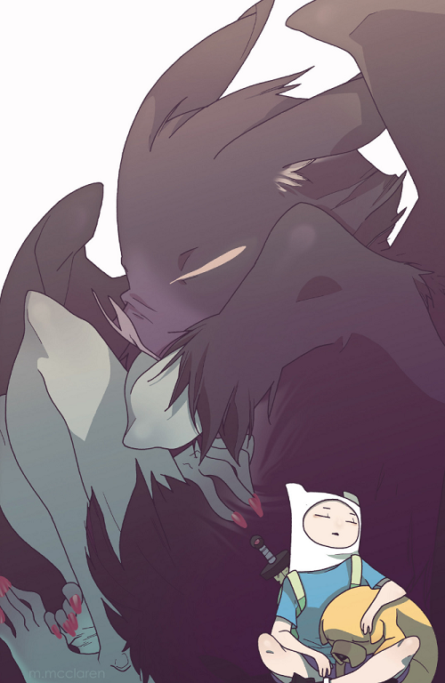
Comic: ADVENTURE TIME #16 (cover d)
Artist: Meredith McClaren
First of all this picture is just beautiful. So subtle. It would be cute and tender pic even if we didn’t know who the characters were.
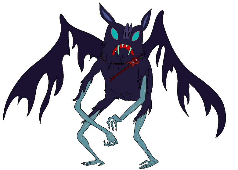
But what makes this an interesting cover to me is the un-stylized finished product. ADVENTURE TIME is known for its frankly crude illustrations. You know that giant bat the little boy and his dog are snuggling into? This is how she might look in an ep of ADVENTURE TIME:
ADVENTURE TIME goes so far out of its way to make the little boy Finn to look awkward and snaggle-toothed; his Mr. Fantastic-like dog Jake implausibly proportioned. But in McClaren’s cover, they are just a really cute kid and his dog.
Gorgeous.
LOVE
MIKE
August 24th, 2013 — Comics, Superficial Satudays
My friend and podcast partner Brian David-Marshall (once “Brian Marshall”) suggested this classic CONAN THE BARBARIAN cover by the similarly-hyphenated Barry Windsor-Smith (credited at the time as “Barry Smith”):
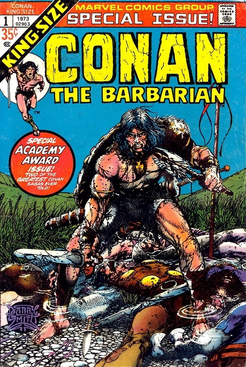
Comic: CONAN THE BARBARIAN ANNUAL VOL 1 #1
Artist: Barry Smith / Barry Windsor-Smith
Barry Windsor-Smith is one of my 2-5 all-time favorite comic artists. I would read his ARCHER & ARMSTRONG all day if he were still writing and drawing it. At his max level of focus, BWS’s attention to detail and line work are simply second-to-none. Keeping in mind the more limited coloring capabilities of comics in 1973 (relative to 2013), let’s run down five [with Flores] or so details that BWS could have ignored but chose to include / spend time on here…
- Conan is standing in water. He bothered to draw the little puddle effects around Conan’s ankles (and the bodies around him), triggering some slight coloring / light / shading differences above and below the wet.
- Conan’s feet / toes / toenails: BDM loves to point out certain flashy / big name artists who either don’t draw feet, mysteriously have smoke coming up around characters’ feet (so they don’t have to draw them), crop frames so they don’t have to draw the feet, or just draw feet badly. BWS? Here’s a foot — not a boot — and here’s some toenail ink while I’m at it. Eff you.
- Conan’s hair versus whatever is on his left shoulder (animal fur?)… Point being one of them you get the sense of not just length / texture / even oil… The fur or whatever is on his left shoulder is ostensibly a similar substance but using the same inks can convey this wiry or bristly texture. Most artists wouldn’t even ink individual hair details on the featured foreground figure.
- Blood – The sense of wetness he conveys with black ink on Conan’s sword and axe is basically perfect.
- The grass / wheat / fauna directly behind the characters – as in he bothered to draw in these details. In fact, the work on his long grass better than most artists’ inking of foreground characters / anything at all.
… But that’s just five or so things out of this 1973 cover.
Here’s the kicker. In big, bold, letters this annual proclaims itself full of “two of the greatest Conan sagas ever told” … which means it is a reprint issue.
Back when he was critiquing my work on a regular basis BDM — a longtime comics editor in a previous life — would talk about a step that good artists took X pages into their careers. They would start good enough to get work and then at some point — bam! — they were at some crazy next level. BWS — “Barry Smith” back then — was the artists of the original story as well. This was what that cover looked like:
What a difference a day three years makes.
LOVE
MIKE
August 17th, 2013 — Comics, Superficial Satudays
Just got back from watching KICK-ASS 2 at the movies.
In honor of this weekend’s soon-to-be blockbuster sequel, maybe the most arresting cover from the original KICK-ASS:
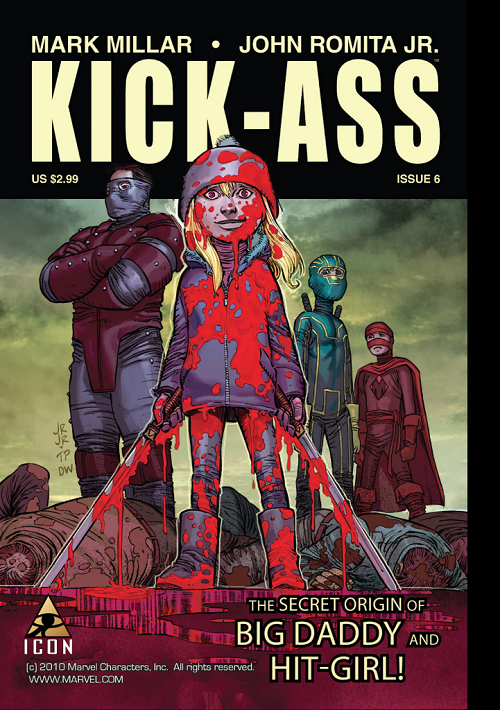
Comic: KICK-ASS #6
Artists: John Romita, Jr. (pencils) and Tom Palmer (inks)
What have we got here?
I figure most of us — at least those even passingly familiar with KICK-ASS as a property — are desensitized to the ultra-violence of it. But probably at some point in our pasts an image like the cover to KICK-ASS #6 would have demanded a double-take.
A little girl, drenched in blood, a sword in either hand; standing over the bodies of fallen men. Can you say “juxtaposition”?
The girl is Hit-Girl (as the cover indicates); possibly the most important unique element of the KICK-ASS franchise; a little girl who is a deadly killer. Foul-mouthed as she is lethal, Hit-Girl is actually what made me fall in love with the original movie. And here we have her origin story! (or at least the lower-right-hand-corner claims)
KICK-ASS isn’t for everyone, certainly. I “get” what Millar and Romita (and later Vaughn) were getting at with this. If you understand where they were trying to go, I think there is really only one reading: whiz-bang smashing success. KICK-ASS is the PULP FICTION of superheroes. It is a straight story; not a satire… But it constantly forces you to look twice and think twice, even challenge your suspension of disbelief.
But yeah, even someone who gets it — and buys in — has to think a second over Hit-Girl’s smile in this one… Especially as the titular ass-kicker looks on horrified from behind.
LOVE
MIKE