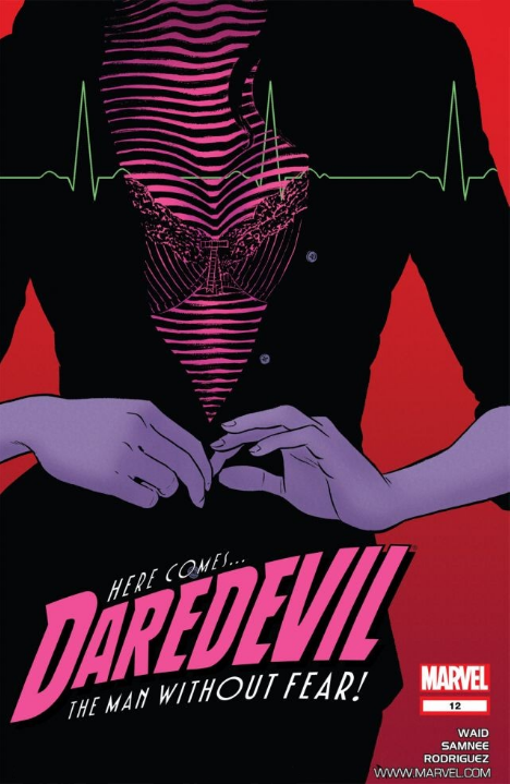
Comic: DAREDEVIL #12 Artist: Paolo Rivera
Mark Waid’s 2011 reboot of DAREDEVIL (DAREDEVIL volume three) has had no shortage of acclaim… Or acclaimed artists. The book itself was unapologetic old-school fun, and well-written without approaching some of Waid’s more epic superhero work (say KINGDOM COME, or even FLASH)… But that didn’t stop it from being basically the best mainstream superhero book in the spinner racks for the past three years.
A big part of that was that aforementioned succession of superior artists… Paolo Rivera, Marcos Martin, and of course Chris Samnee working in similar, stylized, and high-velocity styles. Samnee is the most associated with the book, eventually pocketing an Eisner Award, but it launched with Rivera, who put up quite a few covers even after he quit internals… including this #12 (which featured Samnee interiors). And in case you were wondering, I buy basically everything that Marcos Martin or Chris Samnee draw.
What’s great about this cover?
It’s super stylized. Marvelously minimal. Flat color; bold design decsions; essentially the anti-1990s.
Despite being defined by big chunks of black or negative space, Rivera does a masterful job with the figure’s hands. They are elegant in execution and telling a story of their own that is almost set apart from the other 75% of the piece.
And speaking of telling a story… ?
What’s with all those lines?
This cover shot is from Daredevil’s POV. Daredevil is blind, and “sees” with a superhuman radar sense. He can “see” the bounce and curve of DA Kirsten McDuffie’s breasts… And the uneven rendering in fact tells us that they are where Daredevil is putting his focus. We even get that radar-esque lines-styling across the top one-third of the image (and with some color contrast) to make sure that we share Daredevil’s focus.
Rivera makes a masterful number of choices here. Daredevil can’t see color, so everything cloth is just black. Kirsten’s shirt is black. Her — is it a skirt? — is all black. We can’t tell, color-wise, where a top ends and another piece of clothing begins. But Daredevil can observe texture, so we get some detail around both her buttons, and some varying design and direction making up her bra… In part because Daredevil himself is “staring” at at.
And yet Rivera draws Kirsten’s hands same-old same-old. No radar styling… They even get some different color treatment. Movement; slightly nuanced color treatment [instead of flat color]. We already said they tell a story of their own. Why?
It looks cool?
That isn’t where Daredevil is putting his focus [so the artist is making it simpler for readers]?
Composition?
Ah, “why” questions.
For me, it’s cool enough that all this, all together looks cool. It’s sexy without being ridiculous; and harnesses a fair number of storytelling limitations and turns them into unique design elements.
Which is all-and-all masterful; at least in this writer’s opinion.
LOVE
MIKE