I am scratching my head on this one.
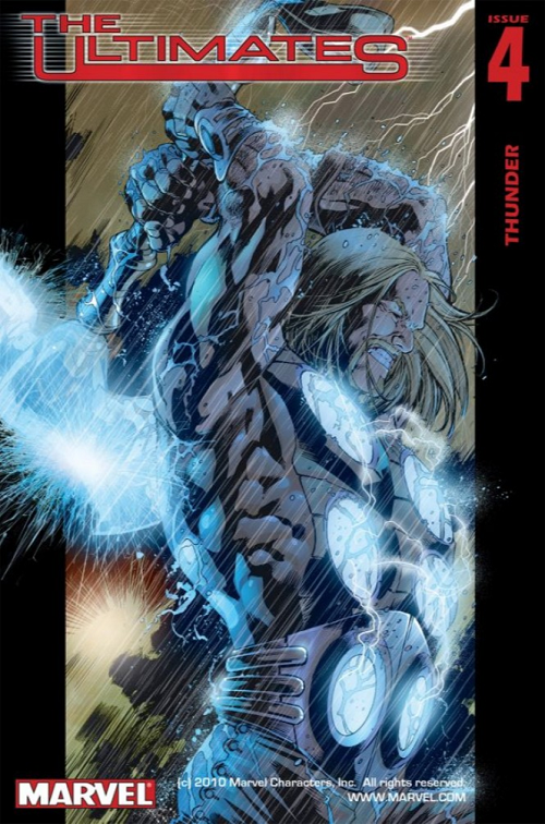
This digital image does nothing to convey the power, energy, excitement, and lighting of Thor’s lightning:

Comic: THE ULTIMATES #4
Artist: Bryan Hitch
You’ll have to accept my apologies, I guess.
But I can dial you back to 2002; it was a wondrous time in comics. BDM was getting THE CRAPTACULAR B-SIDES rolling at Marvel so we talked comics at least as much as we talked about Magic: The Gathering on a daily basis. THE ULTIMATES — Marvel’s big bet uniting the artist of the first arc of THE AUTHORITY with the writer of the controversial second arc of the same — was something special… It was the first time I could remember as a serious comics fan when the best book was also simultaneously the best selling book. Covers like ULTIMATES #4 were just inspiring and engaging and perfect for pulling you into a Marvel universe a half-tick off, where Thor was a revolutionary, Iron-Man was a drunken egotist, and Captain America was kindhearted Republican (and Hulk was an asshole).
[I assume] Paul Mounts’s [Paul Mounts being the credited interior colorist] colors jump off the cover and scream Scream SCREAM “pick this the hell up!” It’s you can almost hear the pitter-patter of those innumerable raindrops pummeling their god of storms; deep black gutters on either side, frame broken by the electrically-crackling / nail-driving weapon of mass destruction, boxing in and highlighting those sparkling arcs by their bottomless negative space; one lick of Thor’s hair flipped northward like some defiant Charlie’s Angel head-toss.
I mean you can look at the screen cap and appreciate — I assume — the skill of Hitch’s pencil.
But it just doesn’t “pop” like it should, like it does, like I remember it did in real life.
You’ll just have to trust me. Good, good stuff.
LOVE
MIKE
0 comments ↓
There are no comments yet...Kick things off by filling out the form below.
You must log in to post a comment.