My friend and podcast partner Brian David-Marshall (once “Brian Marshall”) suggested this classic CONAN THE BARBARIAN cover by the similarly-hyphenated Barry Windsor-Smith (credited at the time as “Barry Smith”):
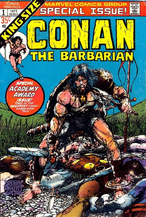
Comic: CONAN THE BARBARIAN ANNUAL VOL 1 #1
Artist: Barry Smith / Barry Windsor-Smith
Barry Windsor-Smith is one of my 2-5 all-time favorite comic artists. I would read his ARCHER & ARMSTRONG all day if he were still writing and drawing it. At his max level of focus, BWS’s attention to detail and line work are simply second-to-none. Keeping in mind the more limited coloring capabilities of comics in 1973 (relative to 2013), let’s run down five [with Flores] or so details that BWS could have ignored but chose to include / spend time on here…
- Conan is standing in water. He bothered to draw the little puddle effects around Conan’s ankles (and the bodies around him), triggering some slight coloring / light / shading differences above and below the wet.
- Conan’s feet / toes / toenails: BDM loves to point out certain flashy / big name artists who either don’t draw feet, mysteriously have smoke coming up around characters’ feet (so they don’t have to draw them), crop frames so they don’t have to draw the feet, or just draw feet badly. BWS? Here’s a foot — not a boot — and here’s some toenail ink while I’m at it. Eff you.
- Conan’s hair versus whatever is on his left shoulder (animal fur?)… Point being one of them you get the sense of not just length / texture / even oil… The fur or whatever is on his left shoulder is ostensibly a similar substance but using the same inks can convey this wiry or bristly texture. Most artists wouldn’t even ink individual hair details on the featured foreground figure.
- Blood – The sense of wetness he conveys with black ink on Conan’s sword and axe is basically perfect.
- The grass / wheat / fauna directly behind the characters – as in he bothered to draw in these details. In fact, the work on his long grass better than most artists’ inking of foreground characters / anything at all.
… But that’s just five or so things out of this 1973 cover.
Here’s the kicker. In big, bold, letters this annual proclaims itself full of “two of the greatest Conan sagas ever told” … which means it is a reprint issue.
Back when he was critiquing my work on a regular basis BDM — a longtime comics editor in a previous life — would talk about a step that good artists took X pages into their careers. They would start good enough to get work and then at some point — bam! — they were at some crazy next level. BWS — “Barry Smith” back then — was the artists of the original story as well. This was what that cover looked like:
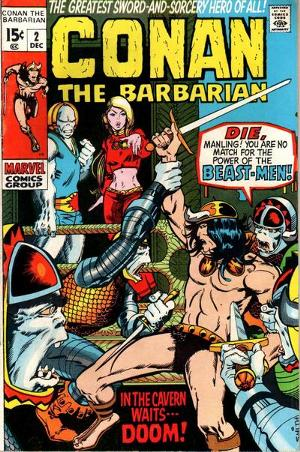
What a difference a day three years makes.
LOVE
MIKE
0 comments ↓
There are no comments yet...Kick things off by filling out the form below.
You must log in to post a comment.